Role
Product Designer /
Frontend Implementation
Timeline
Nov 2021 - Oct 2022 (1 year)
Skills
Data Visualization, Interaction Design, D3.js, Prototyping
What Europeans Eat
Turning raw food consumption data into an interactive visual system
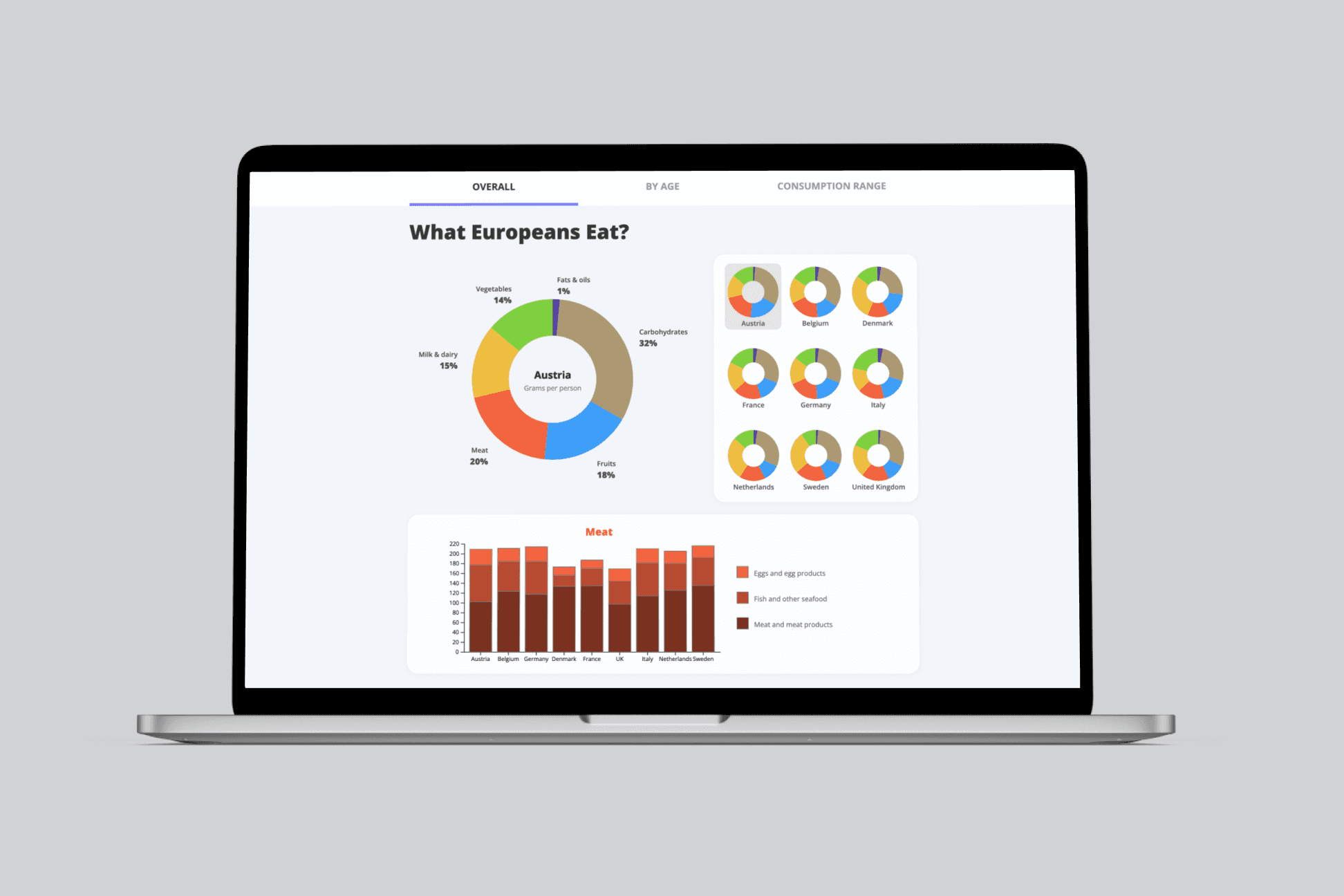
This project involved transforming a large dataset from the European Food Safety Authority (EFSA) into an interactive dashboard that helps users explore food consumption behavior across age groups and countries.
I handled the UX flows, chart design, data modeling, and frontend implementation using D3.js.
Project Outcome
A fully coded interactive dashboard used to communicate European food consumption patterns

The Context
Help tackle global food shortage with data visualisation of food consumption
Growing demand — especially for meat — increases pressure on crops and supply chains. To support better planning, I turned a messy public dataset into an interactive dashboard that helps people understand what Europeans eat, by country, age group, and category.
Key challenges
Structuring a messy, inconsistent dataset into a usable format
Choosing the right chart types to match user questions
Designing interactions that reveal complexity without overwhelming users
Building a fully coded prototype with smooth transitions and dynamic filtering
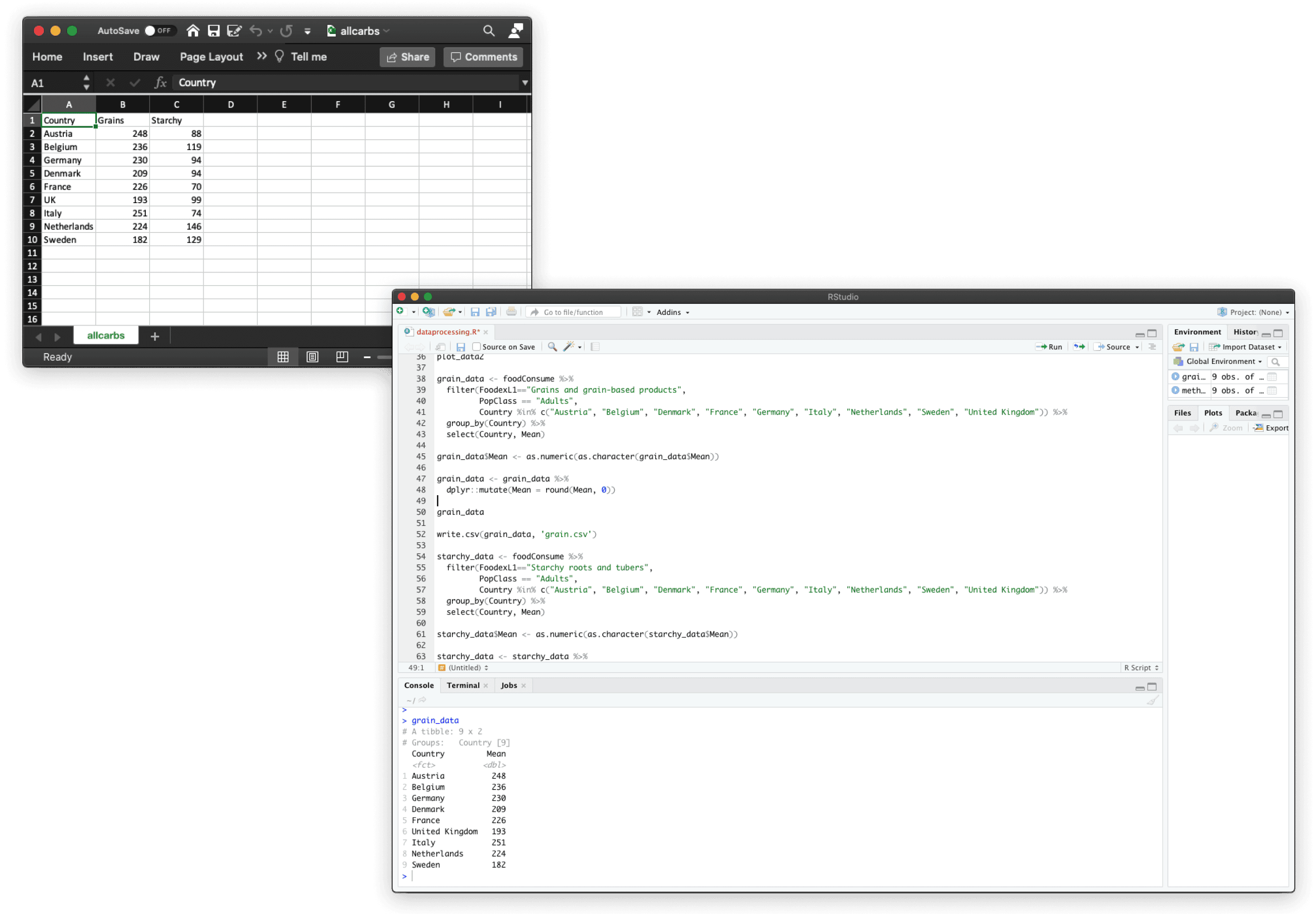
Excel (left) and R (right), the tools I used to clean and process the data.
The Approach
Creating a dashboard in 12 weeks

1. Structuring the data around real user questions
The original dataset was fragmented and inconsistent across countries and age groups.
Instead of visualising everything at once, I first mapped the core questions users might ask — such as how consumption differs by age, region, or food category — and reshaped the data to support those comparisons.
This ensured the dashboard structure reflected user intent, not the raw data schema.
2. Choosing chart types to reduce cognitive load
Each chart type was selected based on the type of comparison it needed to support:
distribution across categories
comparison between countries
trends across age groups
I avoided decorative or overly complex visualisations, prioritising clarity and consistency so users could quickly scan patterns and spot outliers without needing explanation.
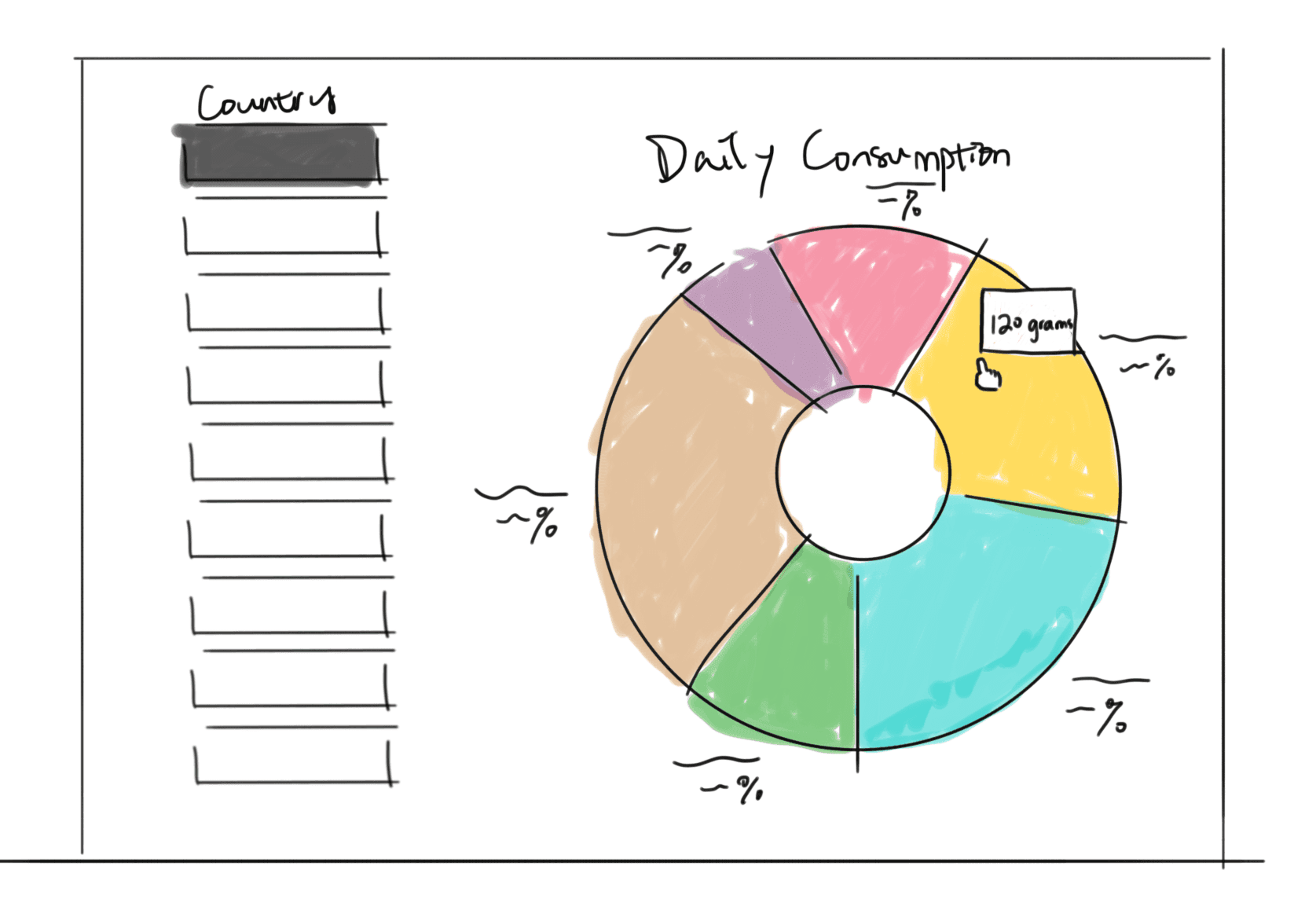
Exploration of chart type
3. Designing interactions to reveal complexity progressively
To prevent information overload, I used progressive disclosure throughout the dashboard:
high-level overviews first
filters and interactions to explore deeper insights
animated transitions to preserve context when switching views
This allowed users to move from summary to detail smoothly, without losing orientation.
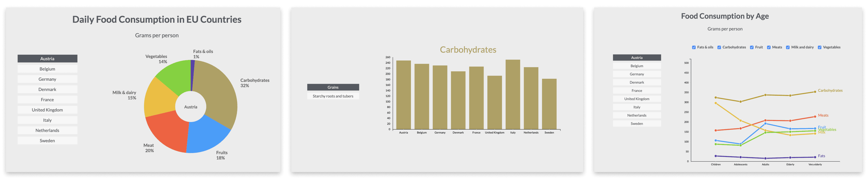
Initial interactive prototype
4. Building and testing through a coded prototype
The dashboard was implemented using D3.js to support real interactivity, including dynamic filtering and smooth transitions.
Building the prototype in code helped validate interaction decisions early and ensured the final experience felt responsive and production-ready.
Final Experience
Iterations after usability testing
Interactive filtering
Users can explore consumption by region, age group, or category.
Pattern discovery
Animated transitions help highlight trends and outliers as users switch views.
Lightweight UI
Charts follow a neutral, minimal visual design to keep attention on the data.


Outcome
I turned a fragmented public dataset into a clear, interactive dashboard that helps users compare food consumption across countries, age groups, and categories. The final prototype demonstrates an end-to-end workflow — from structuring data around user questions to designing a consistent visual system and shipping a coded, interactive experience.
Learnings
Data UX is product UX. The hardest part isn’t the charts — it’s deciding what questions the interface should answer.
Consistency beats novelty. A small, repeatable chart system makes complex comparisons easier to scan and trust.
Interaction reduces overwhelm. Progressive disclosure, filtering, and transitions help users explore depth without getting lost.